EDC Data Visualization Website
Export Development Canada (EDC) is Canada’s export credit agency. Their job is to support and develop Canada’s export trade by helping Canadian companies respond to international business opportunities. They were going through a large-scale transformation that would have significant impact on the employee’s day-to-day tasks. They wanted to build an internal micro-website to help give information to what this transformation meant.
My Role
- Art Direction
- Senior Visual Designer
- Interaction Designer
Starting Base
We hosted the client’s team and led a full day workshop to determine the main requirements for the website. Only a small portion of the content had been written to start. Our workshop results would help establish direction and context for the rest of the content. On the visual side, our only mandate was to use EDC’s primary brand colours — blue and white.
After doing an assessment of the EDC brand, I opted to keep the same font used on their current website and retain the icon style used in previous internal communications. New icons were created and added to the existing set.

Goals, Requirements and Challenges
The micro-website would be used as a communication tool before and during the transformation. The changes in the transformation would impact their technology, their people, their processes and their information. The level and specifics of the impact for each change would vary depending on the role of the employee. We knew there was going to be a large amount of content across the entire website but only a small segment would be relevant to a single user.
One of the biggest challenges was trying to surface the right information to the right user. We divided our target users, all EDC employees, into two key personas — lower level employee and a management level. Our primary user, the lower level employee, would only need to access a small subset of information. Our secondary user, the manager, would be looking for multiple subsets under their department.
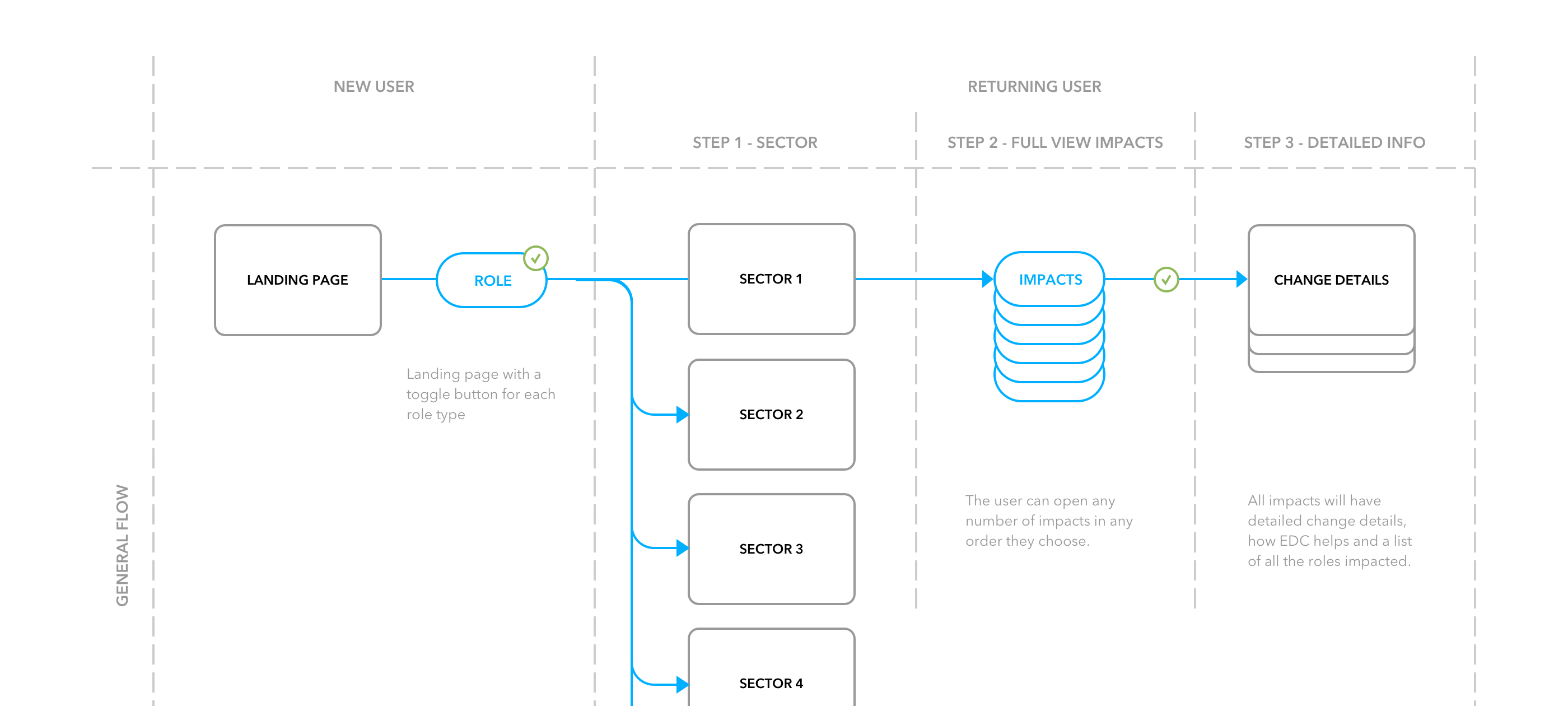
We decided to funnel the content based on the employee’s role. We wanted to show an overview of all the changes that would impact a single employee. Each change would have a greater or smaller level of impact depending on the employee’s role. Each change would have detailed information on how it specifically impacted a role. These factors became the focus of our design decisions.
The Solution
Finding and reading the impact details needed to be easy and attractive to users. We pushed to make this communication tool more interactive and visual than a standard content website. Most of the content would be very dry and technical, we wanted to keep employees engaged so they could better understand the changes coming to their company. We first established how we would visualize the level of impact for all changes. This would be the main screen and entry point into all detailed content.
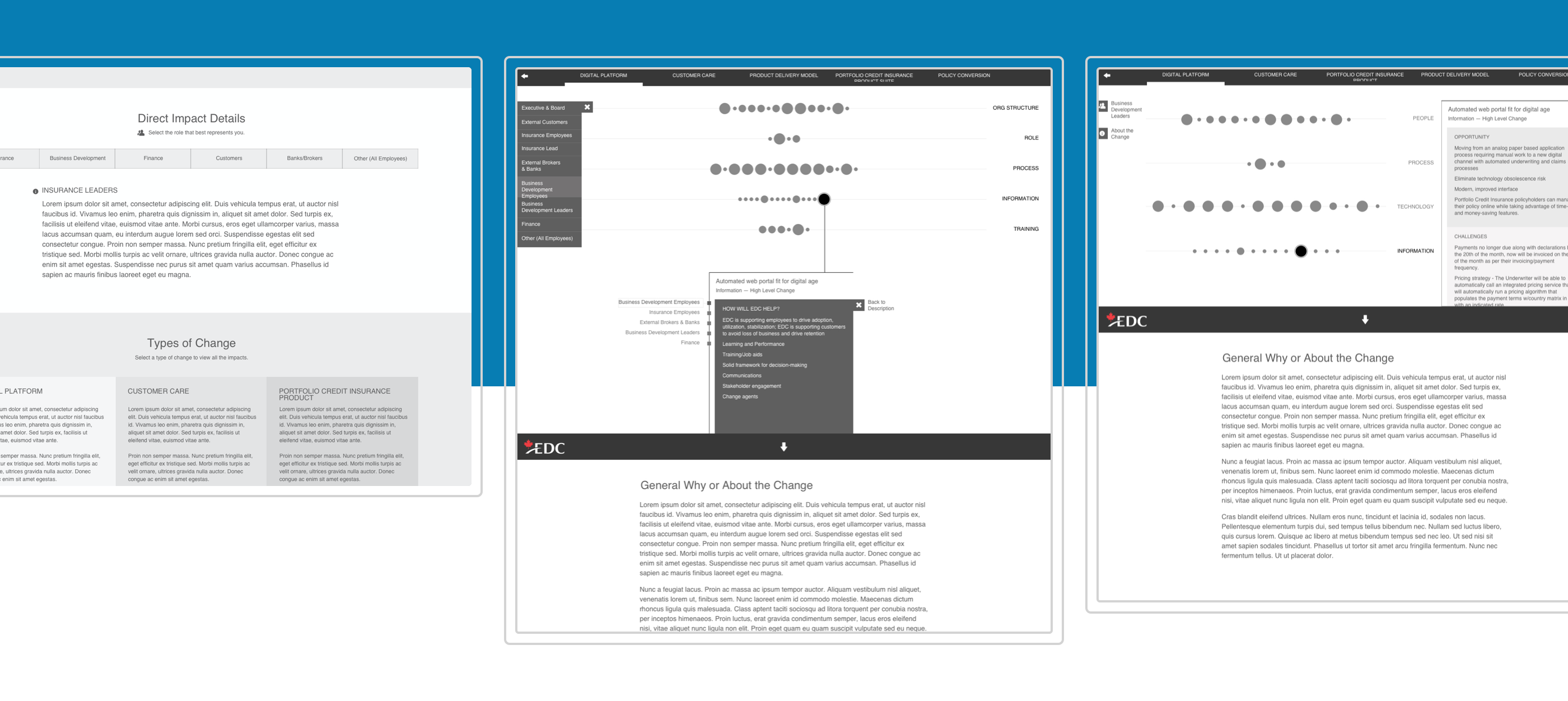
Through whiteboard sketches, user flows and rapid prototyping, I designed some initial wireframe concepts for the main screen. The content would be categorized into five types and then filtered by role.
Bringing it all together
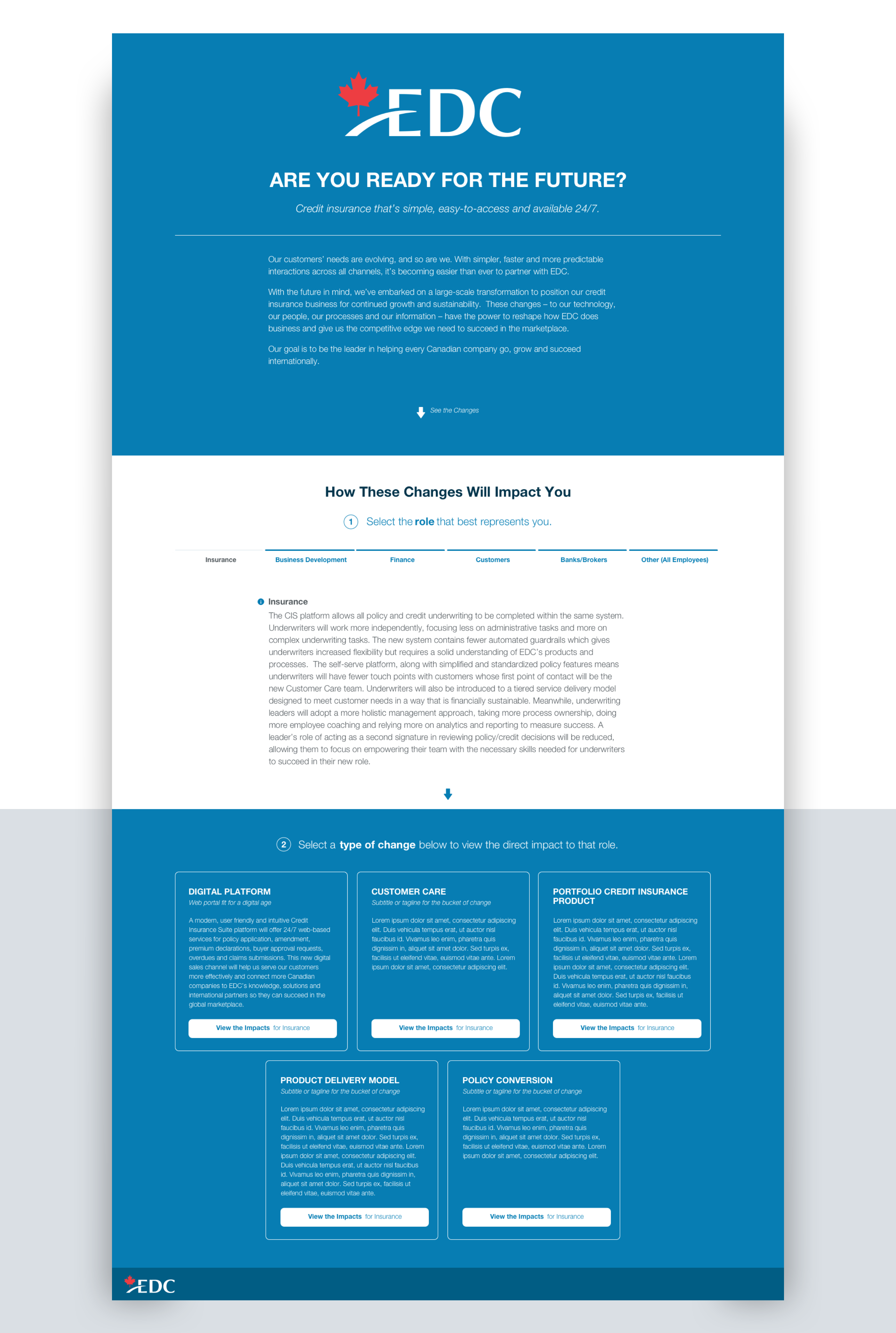
We created an initial landing page to help navigate the user to their optimal starting point. On first launch, users would be asked to select their role’s department and then choose a type of change. Each department and type had a global statement for how the transformation would impact that team as a whole.
Based on the selections made, users would enter the main interactive screen showing the relevant graph. Each circle represented a change. The size of the circle would be used as a visual indication for the level of impact for that change — the larger the circle, the bigger the impact. Circles were placed on a horizontal line that corresponded with one of four categories. The four categories remained consistent for all five types of change. The amount of circles within each category would differ from role to role. The screen would be dynamically built to adapt the amount and size of each circle per role and change type.
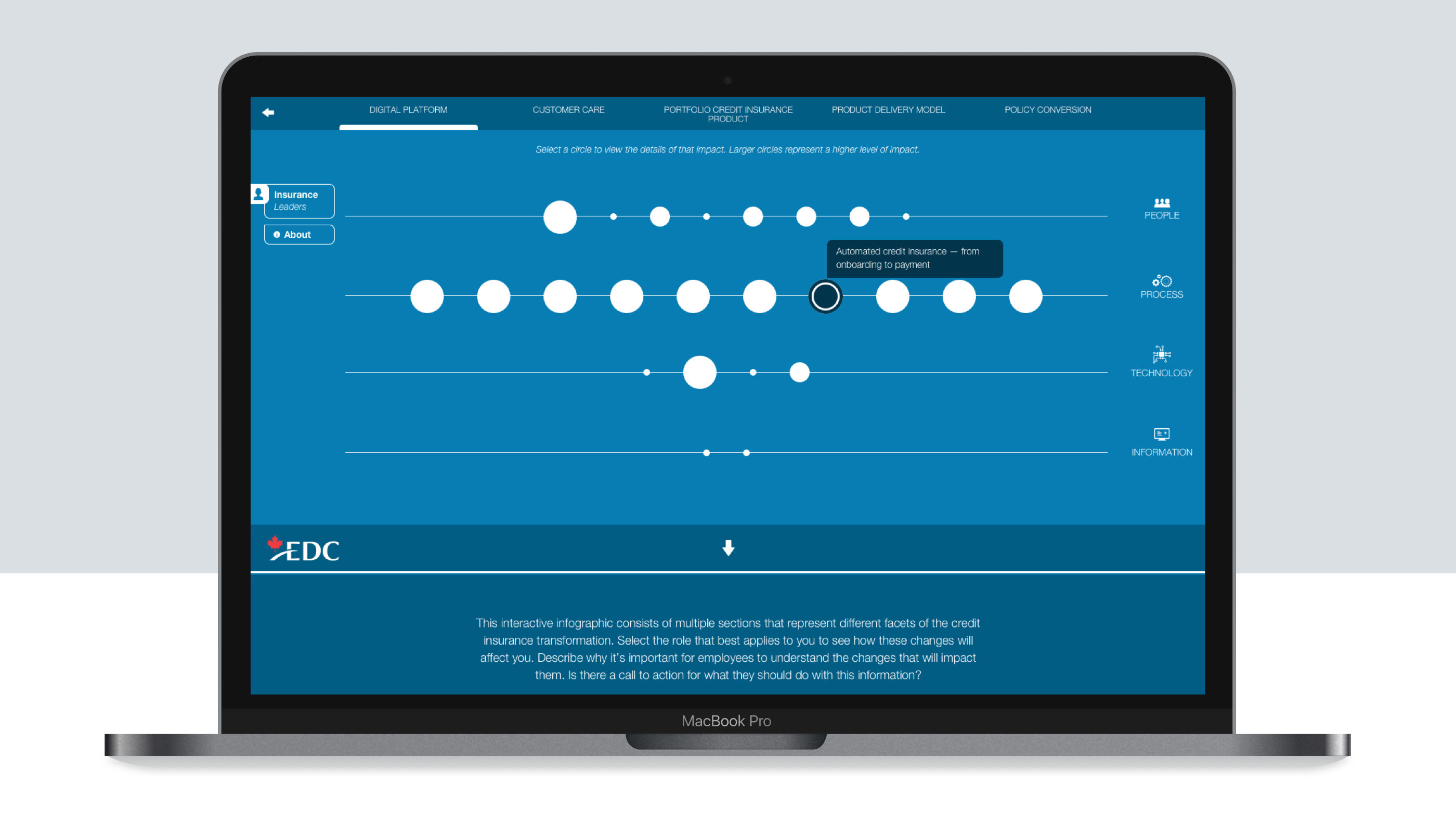
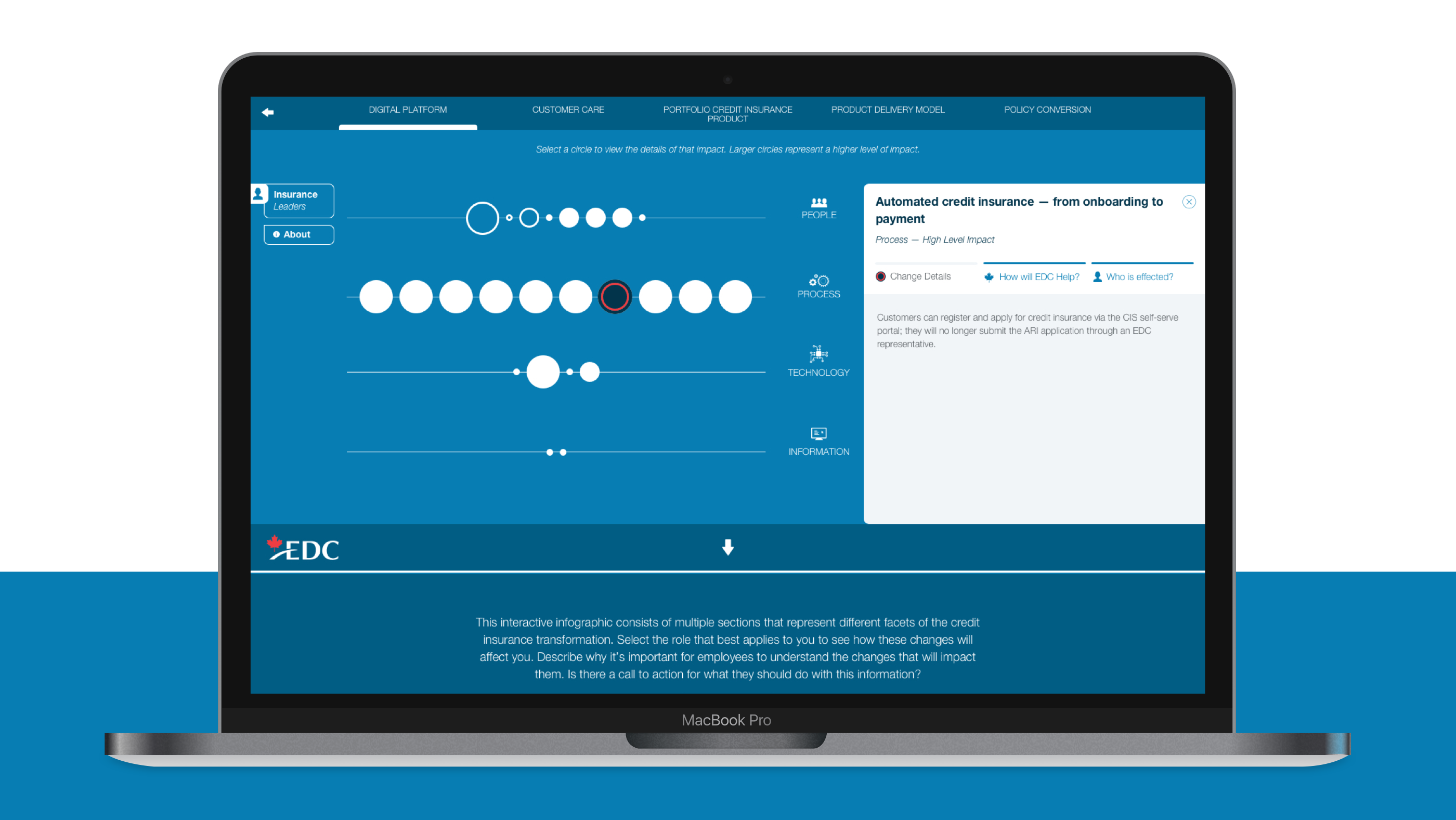
Users could get on overall view on the amount of changes and levels of impact within each category. We added hover states to the circles that would allow users to see a short title for that change. If a circle was selected, a side panel would slide open with more details about that change. The detailed content was divided into 3 tabs that explained what the change was, how EDC would help and who else would be effected. Once a user had selected and opened a change circle, the state of the circle shape would update from showing a fill to a stroke, allowing the user to keep track of their progress.
Flexible Templates
The graph would repeat across all five change types. Users could navigate to any other type by using the tabbed menu bar at the top. We added a role selection menu on the side so that managers could easily switch views between different role. The department’s global statement was also available as an overlay from this selection menu.
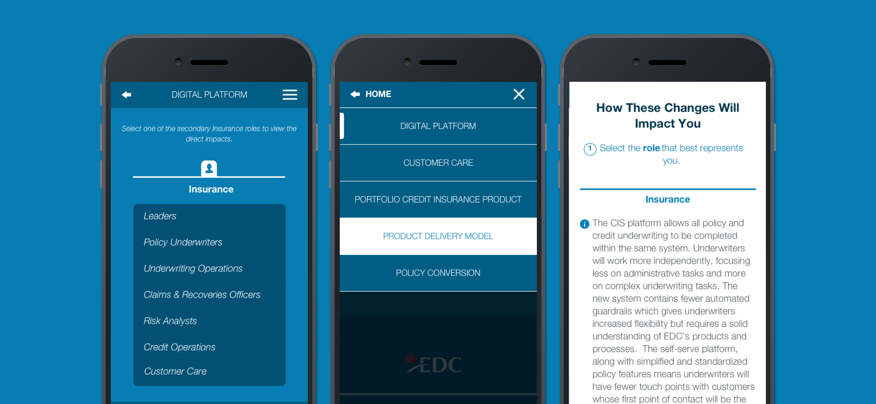
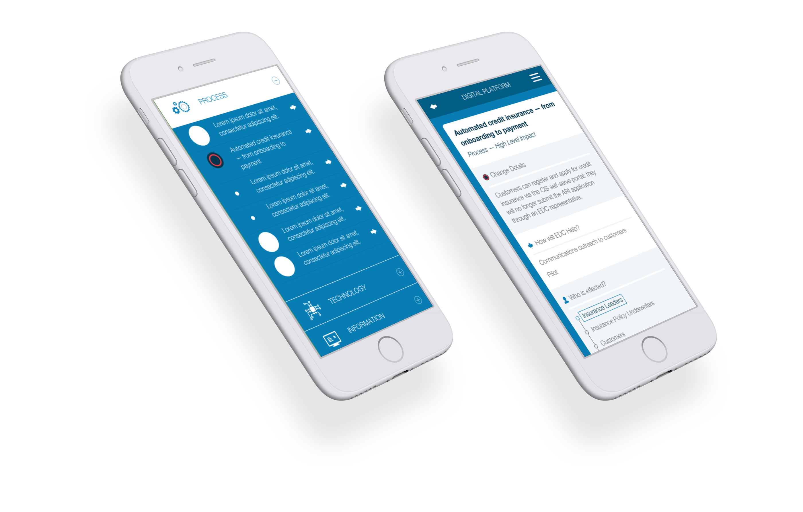
Responsive
The information from this communication tool would be primarily read during work hours from the office desktop computers. However, we wanted to support a way for the information to be available remotely on mobile phones. We adapted the graph layout design to function on handheld devices while retaining its dynamic flexibility. Users can open and collapse each category to see all their change points. The circles are still sized accordingly to show the level of impact. Users can tap a change list item to enter the details view.
