Music to My Ears
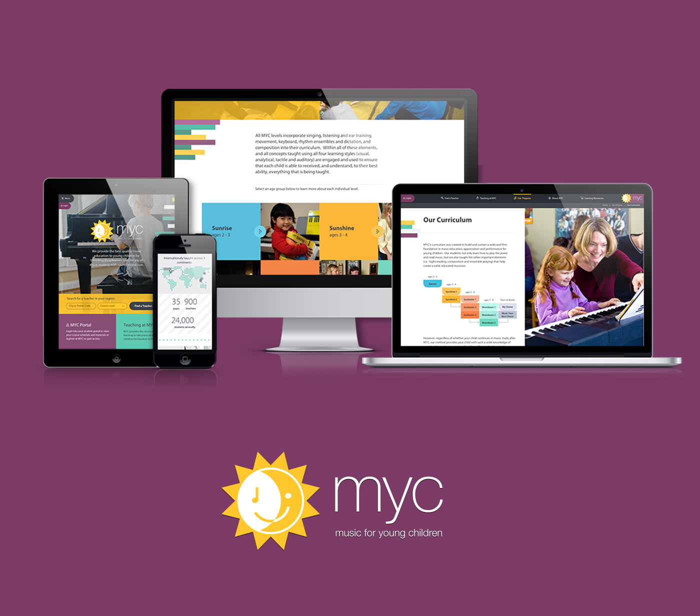
Music for Young Children have provided the best quality music education to young children for 39 years, spanning 3 continents across the globe. In order to provide more than 900 teachers and 24,000 students annually with the best service, MYC chose bv02 to modernize their registration process and redefine the curriculum's process.
My Role
- Art Direction
- Senior Visual Designer
- Interaction Designer
Starting Point
The current registration process was being done manually by the head office. Users would contact MYC staff to be paired with a teacher in their local area. After registration, teachers would then need to manage all communications with students or parents by email throughout the course of the program. Our goals were to increase the amount of teachers under the MYC umbrella and attract new parent registrations. We proposed to re-design the MYC website that would include a new user portal and partnering app. With the overhaul of new digital products, we put forward a new brand and identity. Below you'll find the original logo and website.

Find a Teacher
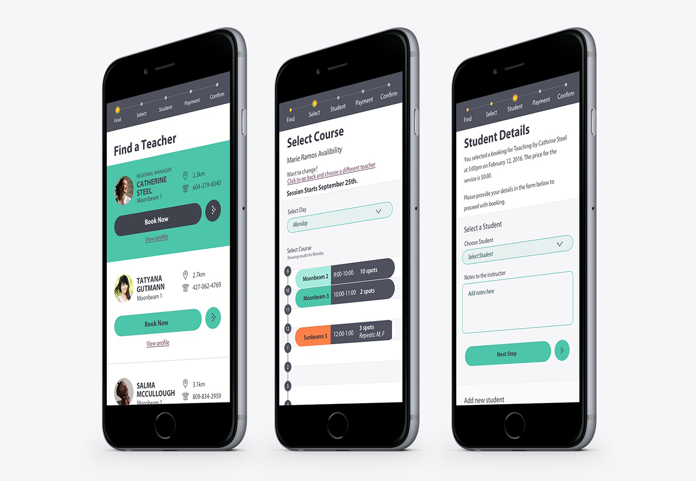
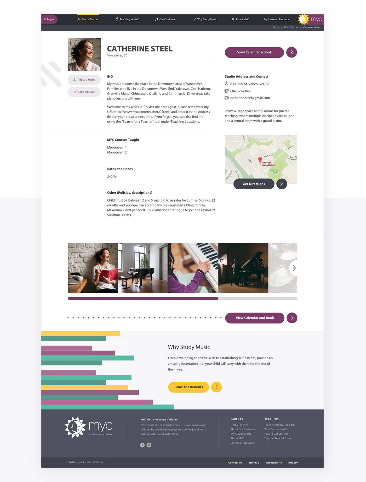
Our new user portal allowed teachers to create a public profile that would display their local area and what courses they offered. Having this data set enabled the website to support a new feature that would let parents easily find and review potential teachers. Once found, parents could then continue through the full registration flow online — making the process much quicker and easier.
Creating an Ecosystem
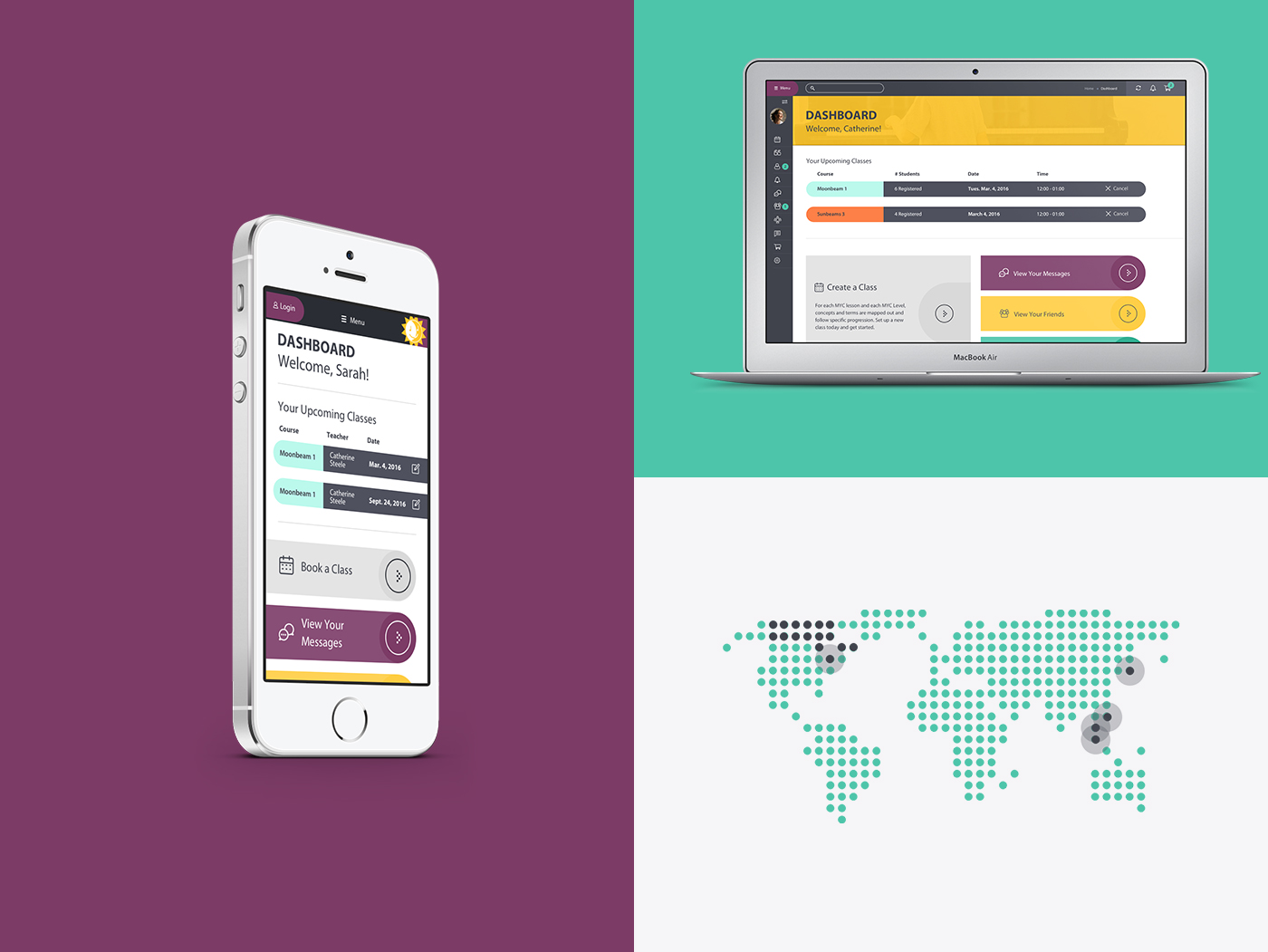
Each new user would get access to the MYC portal through the website and mobile app. Both the needs of parents and teachers needed to be addressed in the portal while keeping development efforts minimal to hit our scheduled deadline. The user interface was designed using reusable components and layout templates that could be easily modified to fit each user type’s need. Our portal dashboard kept the same responsive layout for both teachers and parents but displayed key information for each. We used this approach for the entire website and app structure.
Personalization
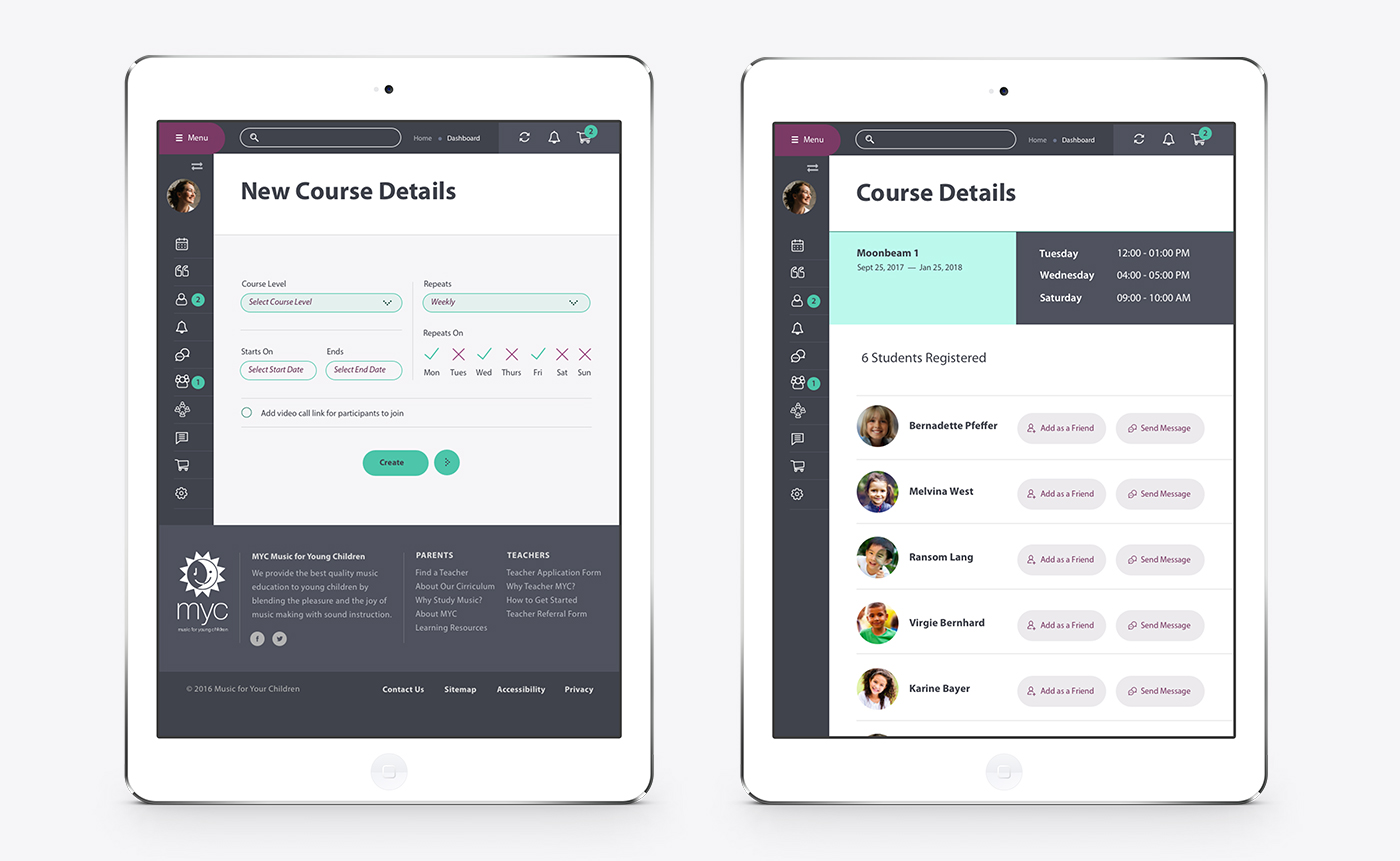
Teachers had their own public profile page that included a description about themselves, prices and specific details about the courses they offered. Each teacher could log into the portal to edit, manage and communicate their current programs and students, as well as, add new course times.
Retaining Users
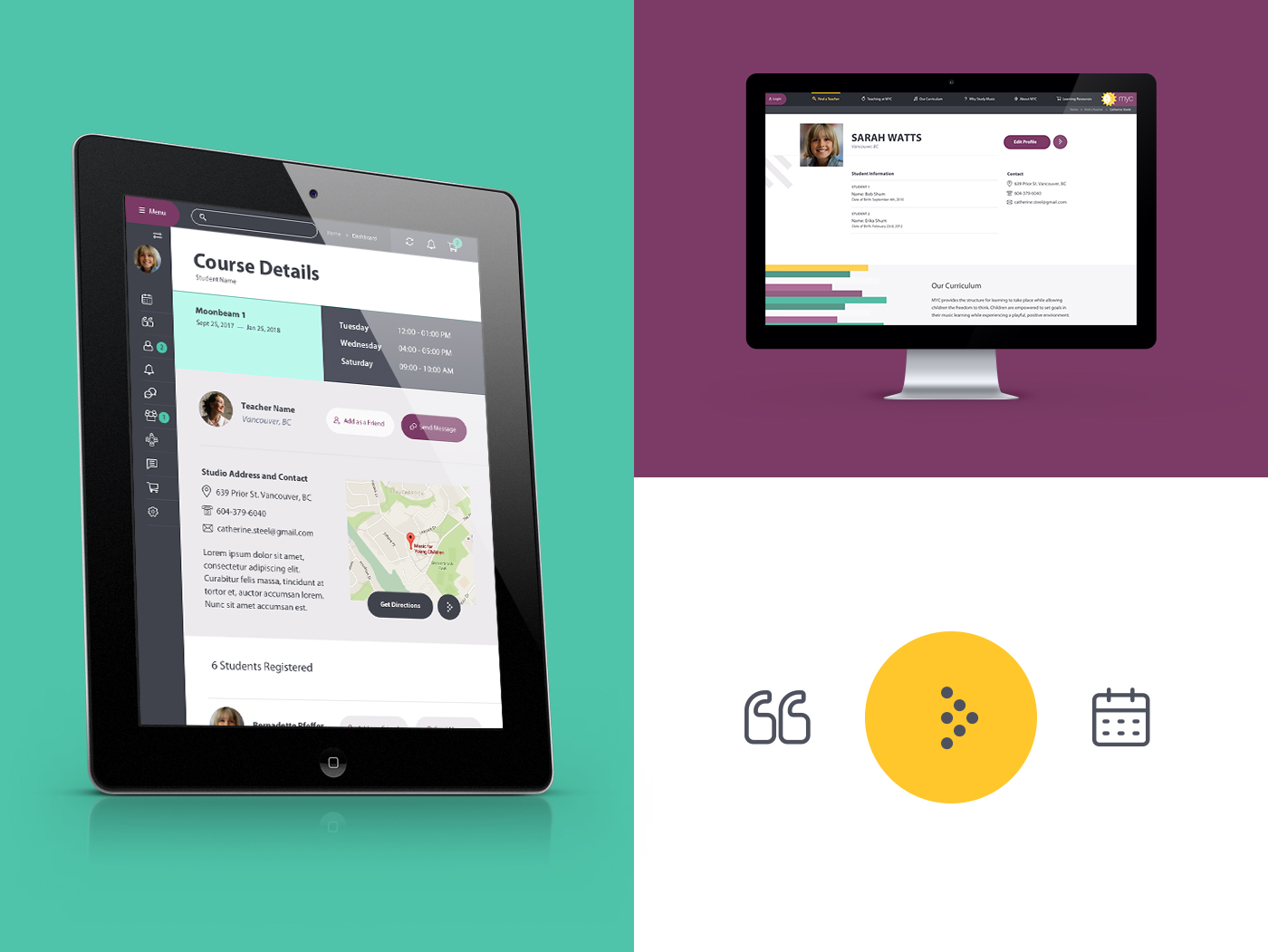
The parent portal became an integral tool in fostering and retaining users; giving quicker access to see the schedules for any ongoing courses, allowing multiple children under one parent account and making teachers and course information more accessible.
Bright, Shiny & Scalable
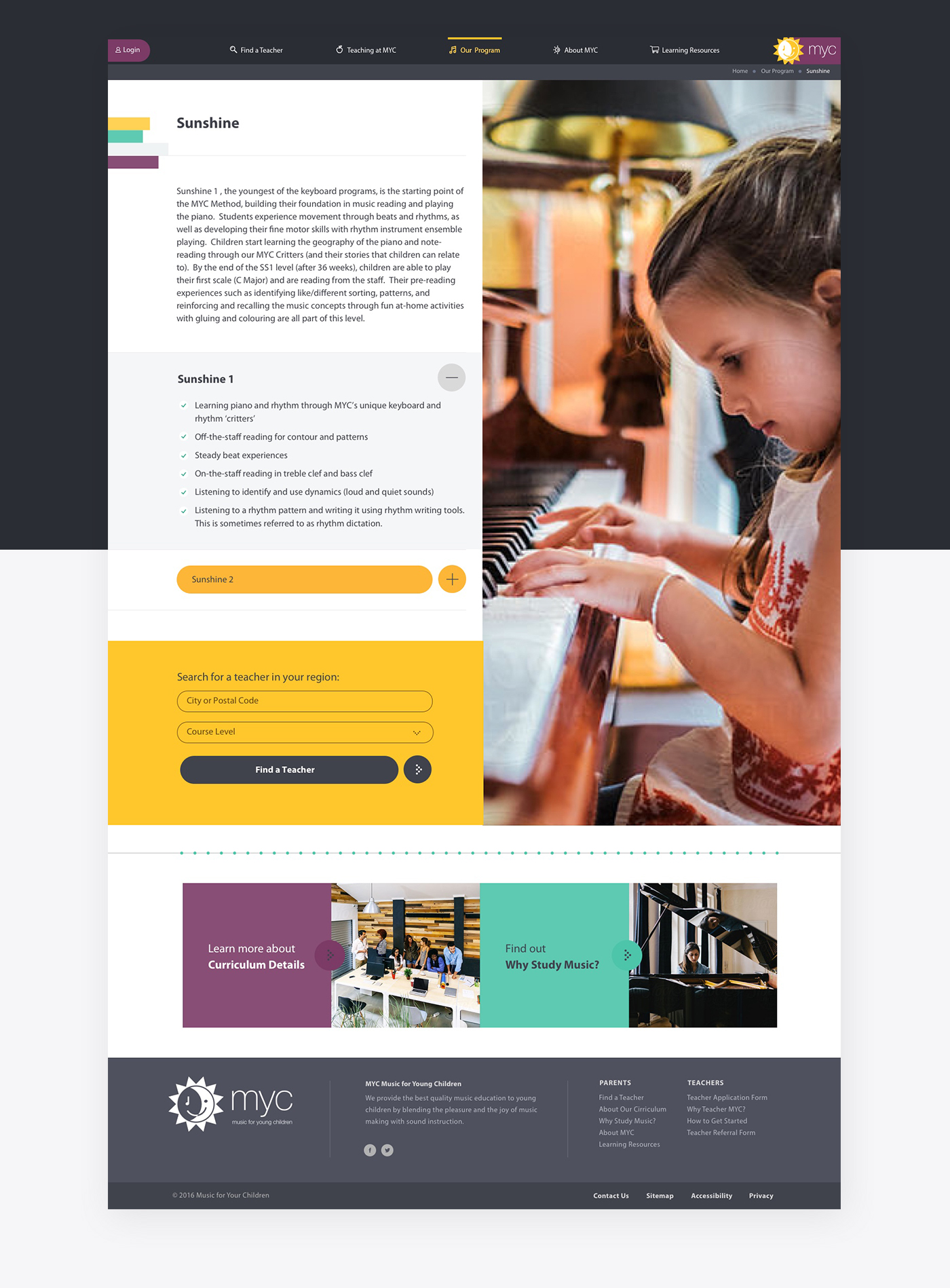
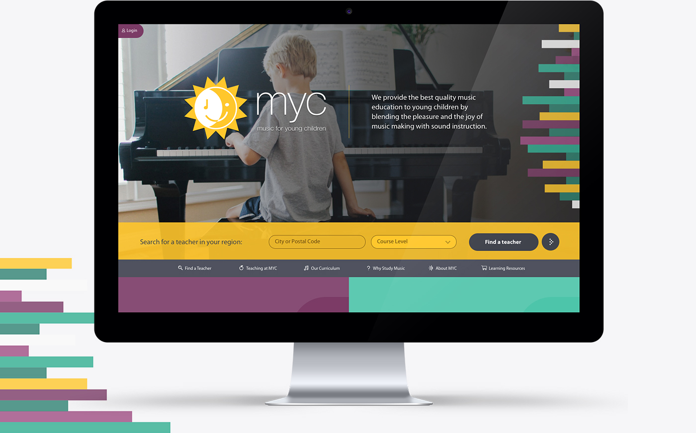
The new brand was created with a new generation of parents in mind. The new identity needed to focus on clean and easily digestible information but also show off the family fun MYC flavour. The colours and elements were inspired by the balance of structure and freedom within music. Music is very mathematical with order and structure but there’s also a lot of freedom and spontaneity involved on the creative side. Another key component of the MYC program is that all of the foundation lessons are taught on the piano.
The result was a pattern of rectangle bars all the same height but varying lengths and colours — blending piano keys, structure and freedom. Throughout the website and app, the style made use of large imagery and light rounded icons to showcase the fun atmosphere of an MYC lesson. To contrast with the rectangles, all buttons and links on the website and app use circles and lozenges as differentiators. The brand’s colours and shapes are seen within the re-usable components, created for content sections and call to action blocks making it more efficient for the development team.
