Re-Imagine TV
The R&D department at Turner Broadcasting System Inc. came to You.i TV with a goal. “To reimagine the traditional user experience for video consumption. What if...”
We designed and built a demo app for exploration and experimentation. This would be a playground for innovation, funneling ideas and features into production apps for their network brands such as: TNT, TBS, NBA, Cartoon Network, Bleacher Report and TruTV.
My Role
- UX Team Lead
- Senior Interaction Designer
- Senior Visual Designer
To comply with my non-disclosure agreement, I have omitted and obfuscated confidential information in this case study. The information in this case study is my own and does not necessarily reflect the views of the client.
Starting Base
I led a discovery session and design sprint with the client’s team over 3 days to establish the key problems we wanted to solve and to define the scope of the project. We arrived with two principal problem statements that focused on both the user needs and the business needs.
Personalization, Improved Discovery, Engagement
As a user I want a dynamic content discovery experience designed based on my preferences, habits, time, location and social networks.
Personalization, Monetization
As a business I want the ability to dynamically change parts of the UI to rapidly monetize, personalize, test and refine engagement, consumption and acquisition flows.
Research
After conducting a competitive analysis and collecting data points from previous studies surrounding behaviours and patterns for watching television, here is what I learned:
“...main reasons that people watch television: to unwind, for comfort, to connect, for an experience, to escape, or to indulge.”

WHY
Linear (Live TV)
Not only does watching in real-time avoid spoilers, live TV has become a real-time social event that goes way beyond the confines of our living rooms.

WHY
Non-Linear (VOD)
Choices are more personal because it’s not dictated by schedule and there isn’t the wait time for a specific video.
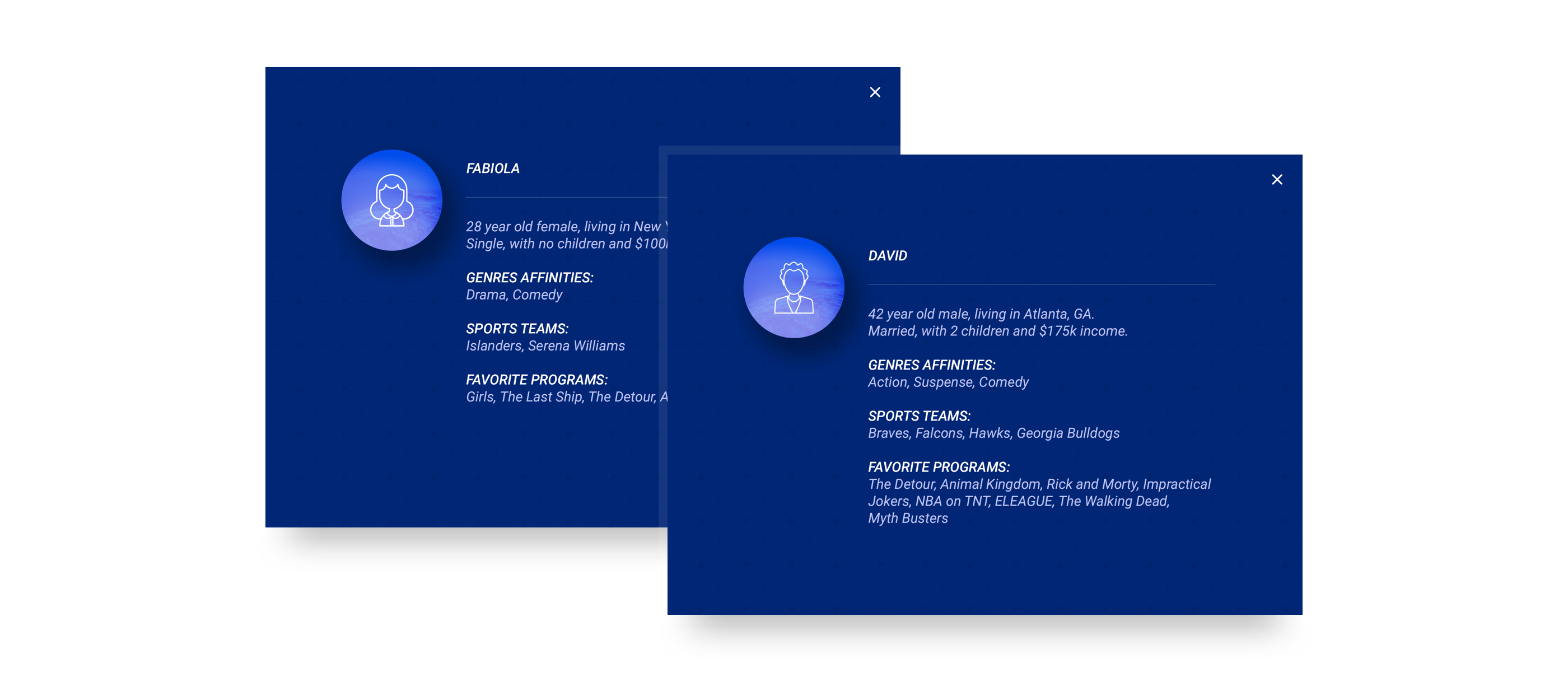
Using data and analytics we received from their research and marketing teams, a few personas were created to represent our target audience. Each persona had their own set of preferences and reasons for watching TV, covering all the most common uses cases found in the research.
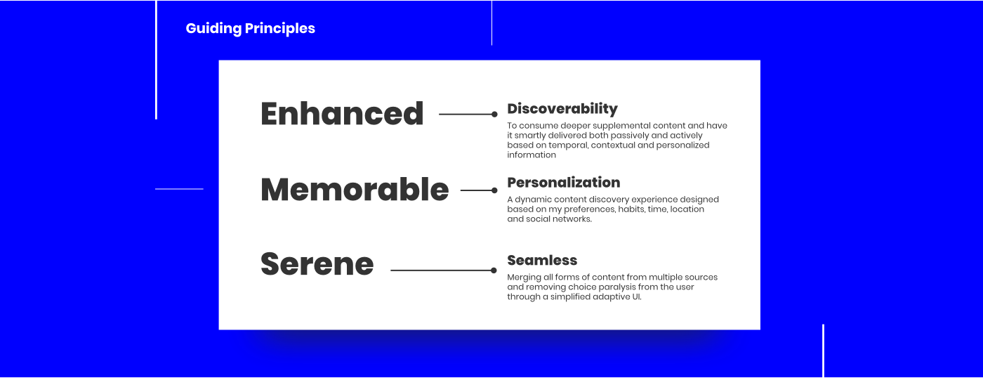
Before starting to talk about solutions, I created three guiding principles that we could refer back to for the full duration of the project life cycle. This would help remind the team what we were trying to achieve holistically.
Initial Concept
We chose to push on personalization and base the core experience on adaptable content structures. The top content for a user would be chosen based on habits, behaviour patterns and preferences, while also making new content discoverable. I built a clickable prototype that would allow us to do some initial user testing and give the client a feel for the main interaction and flow. This allowed us to get more concrete feedback early on and adapt our the skeleton and base frame of the app quickly and easily.

Imagery
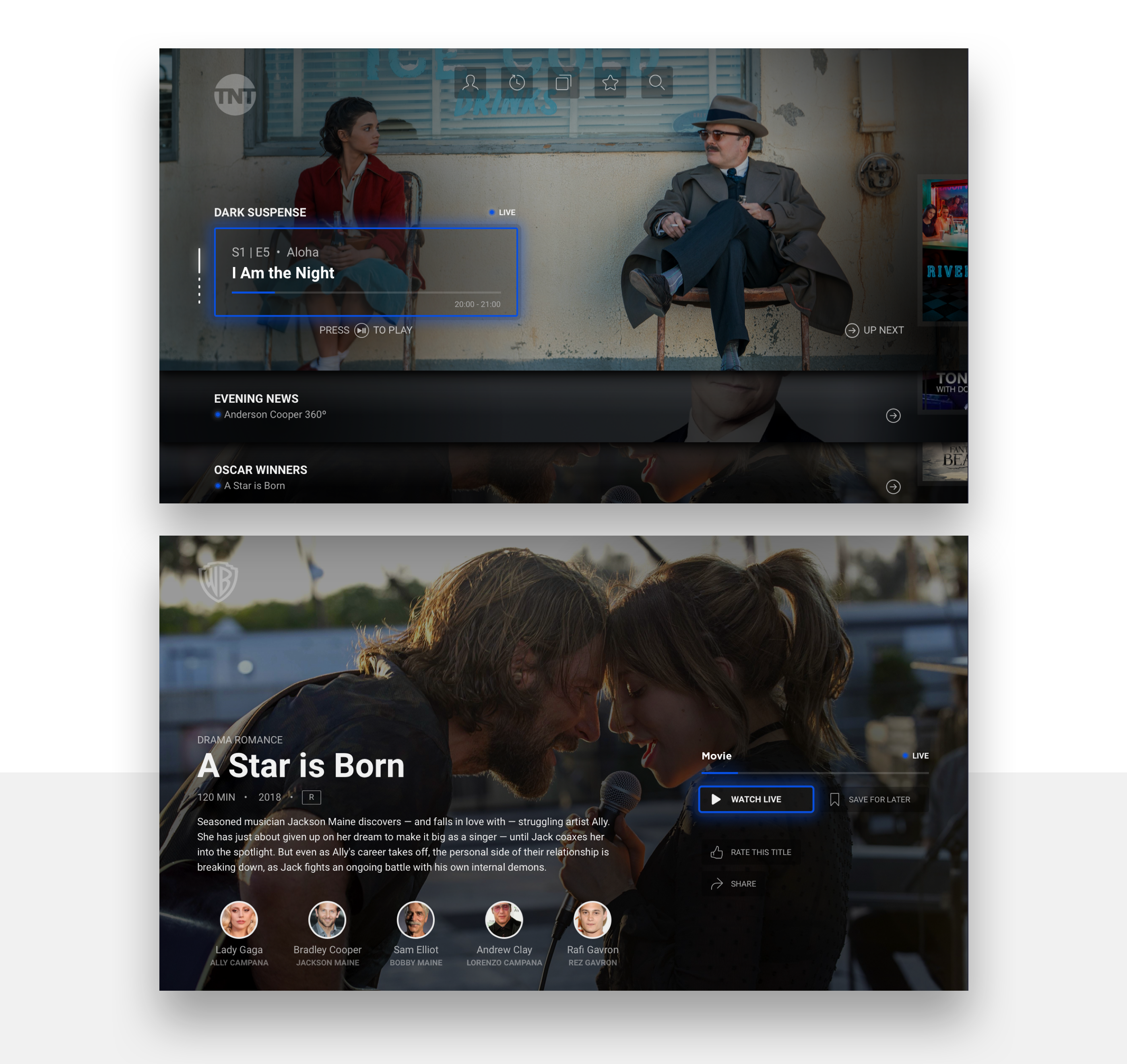
The research indicated that looking at images not only prompted users to watch content, but accounted most of their time spent browsing (as opposed to, say, reading movie titles or descriptions). I chose to use big and bold imagery to represent the content; emphasizing items in focus with large full scale background images.
Themes
The goal was to minimize a user’s chances of getting choice paralysis when browsing and to remove the barrier between linear (Live) and non-linear (video-on-demand) content. The main lander shows a mixed collection of videos, organized into sets of playlists. Each playlist has a common theme and surfaces both Live and VOD content. Users can navigate horizontally to stay within a theme or scroll vertically to change the theme. The idea was to use one axis to find similar or related content and to use the opposite axis to find content that was completely different;
My List
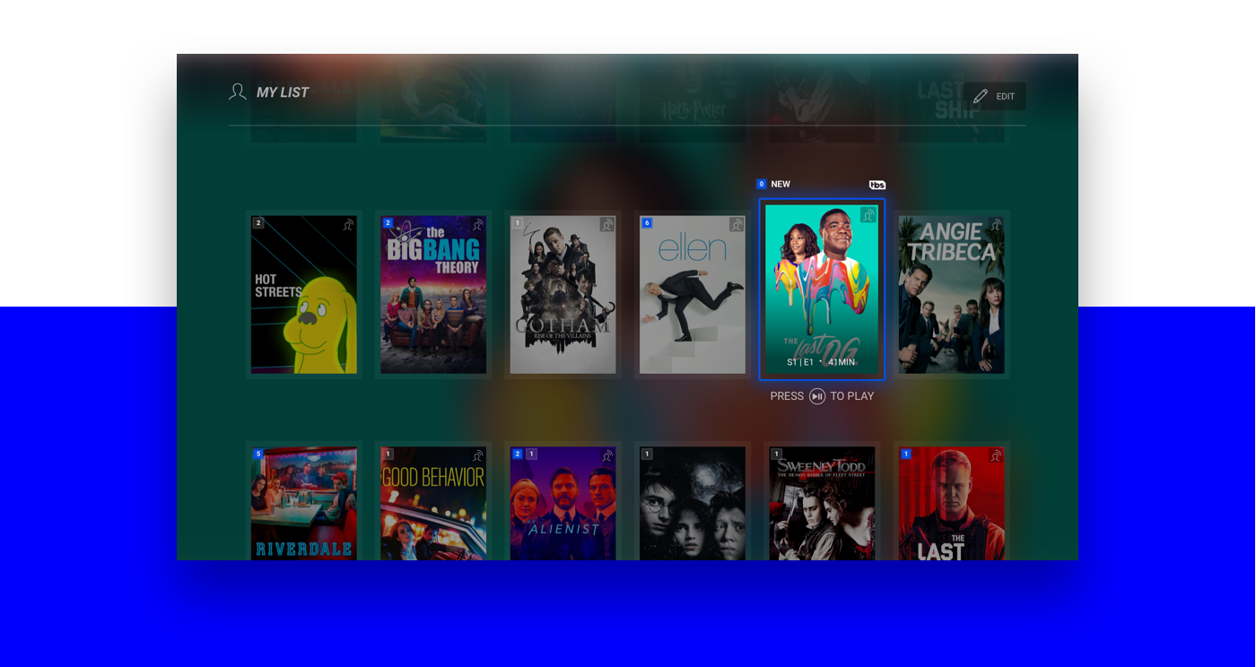
The common watchlist feature was improved with two primary objectives. First, the time users spent looking for their favourite shows every week needed to be reduced. Second, the number of interactions and cognitive load required to jump from one show to another needed to be minimized. I took the concept of playlists from the music industry and blended that with a traditional watchlist or PVR functionality. The mashup became a new kind of system for favouring — My List. Users can choose to subscribe to a Television series; all new episodes will automatically be added to their My List. They can also choose to save individual episodes or movies for later. All of these items are combined into a single smart playlist that gives me a mixed customized set of episodes from all my favourite shows.

End Transition
I needed to support binge-watching, but also allow users to seamlessly switch from one series to another. At the end of a video, we automatically begin playing another video based on the most logical choice; for example, playing the following episode of a series. However, we also surface 2 other options — the first would surface related content (similar genre, actor or other factors) and the second would surface content that was completely different. Depending on the theme or playlist the user is watching, the end transition options adapt to display the most likely options a user would want.
Player & Drawer
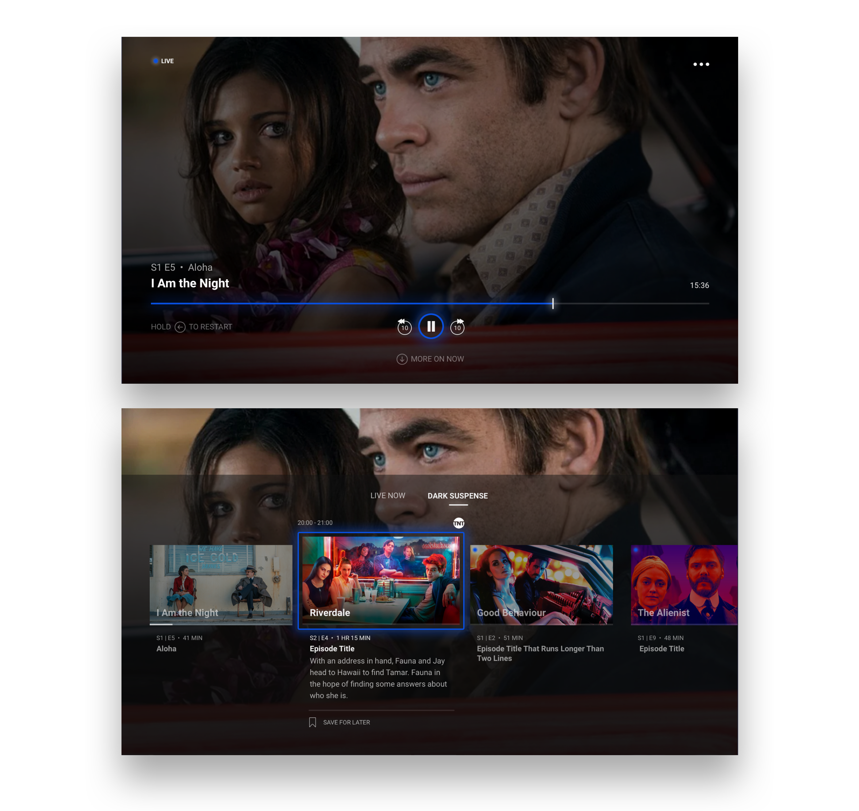
After looking at more traditional cable TV behaviour pattern, we needed a way to let users seamlessly switch from one show to another. Once inside the player, users can keep a continuous video stream while browsing a simplified list of the other assets available. Users can access a content drawer that displays the full playlist of their current theme or the current featured/live asset of each Theme.
Results
We are currently in the process of running usability tests on the app with potential end users. Results coming soon.