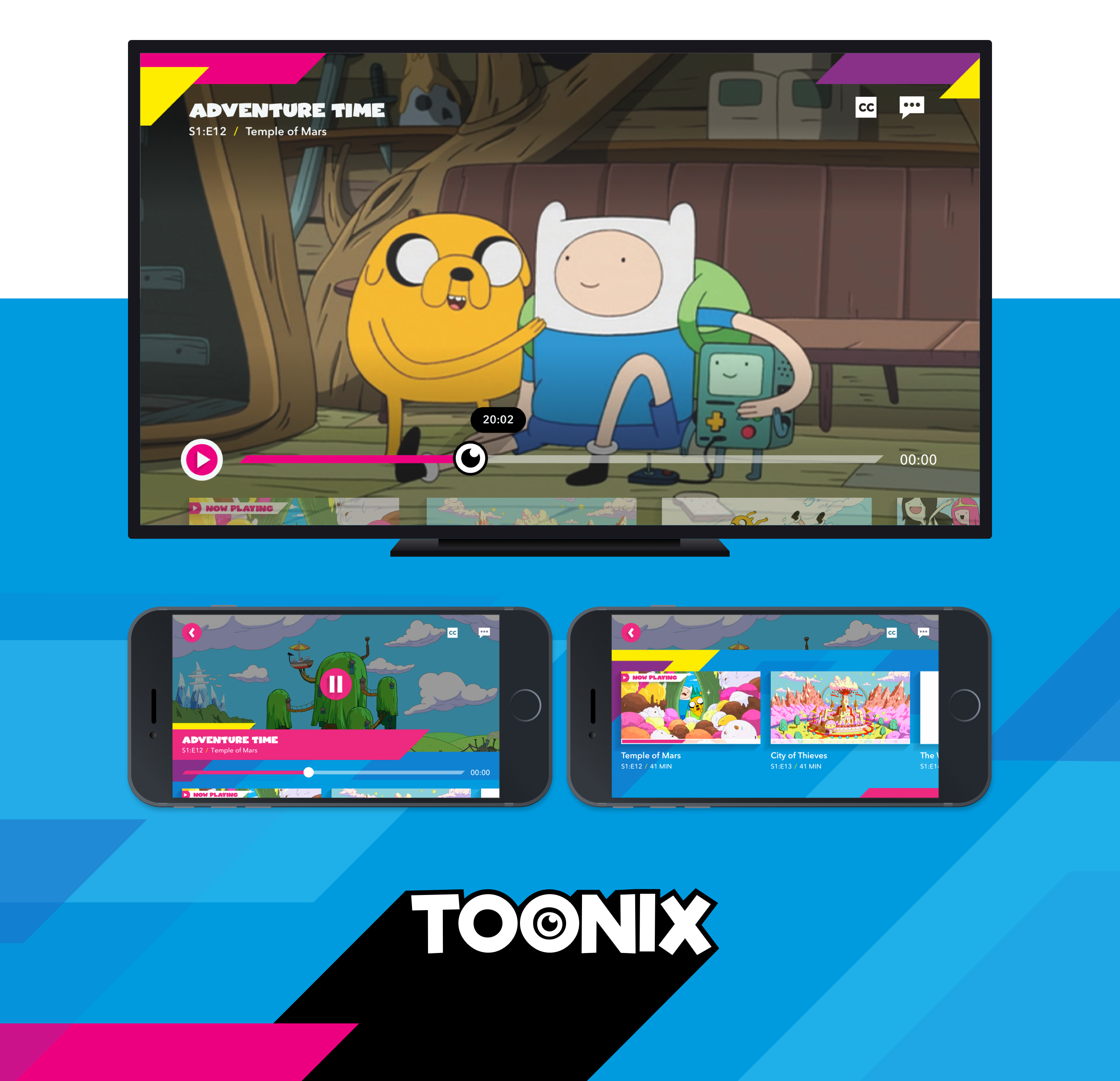
Choose Your Toonix
Toonix is an entertainment playground for kids filled with over 1000 hours of TV shows, movies and games, featuring all their favourite characters. We were tasked with creating an app for their video experience on 10ft, tablet and mobile devices, as well as, a responsive website for registration and account settings. My role as senior designer was to create and lead the interaction and visual design for all pieces of the project.
My Role
- UX Team Lead
- Senior Interaction Designer
- Senior Visual Designer
Starting Base
Toonix had a library of content for on demand consumption accessed through a subscription package. The suite of content includes games (web based), TV Series, clips and movies that were all family friendly. The client’s team shared key takeaways from their extensive customer research and primary business goals. As the creative lead, I led a brainstorm workshop with members of our team and the client’s team to establish the baseline requirements for the app experience and registration process.
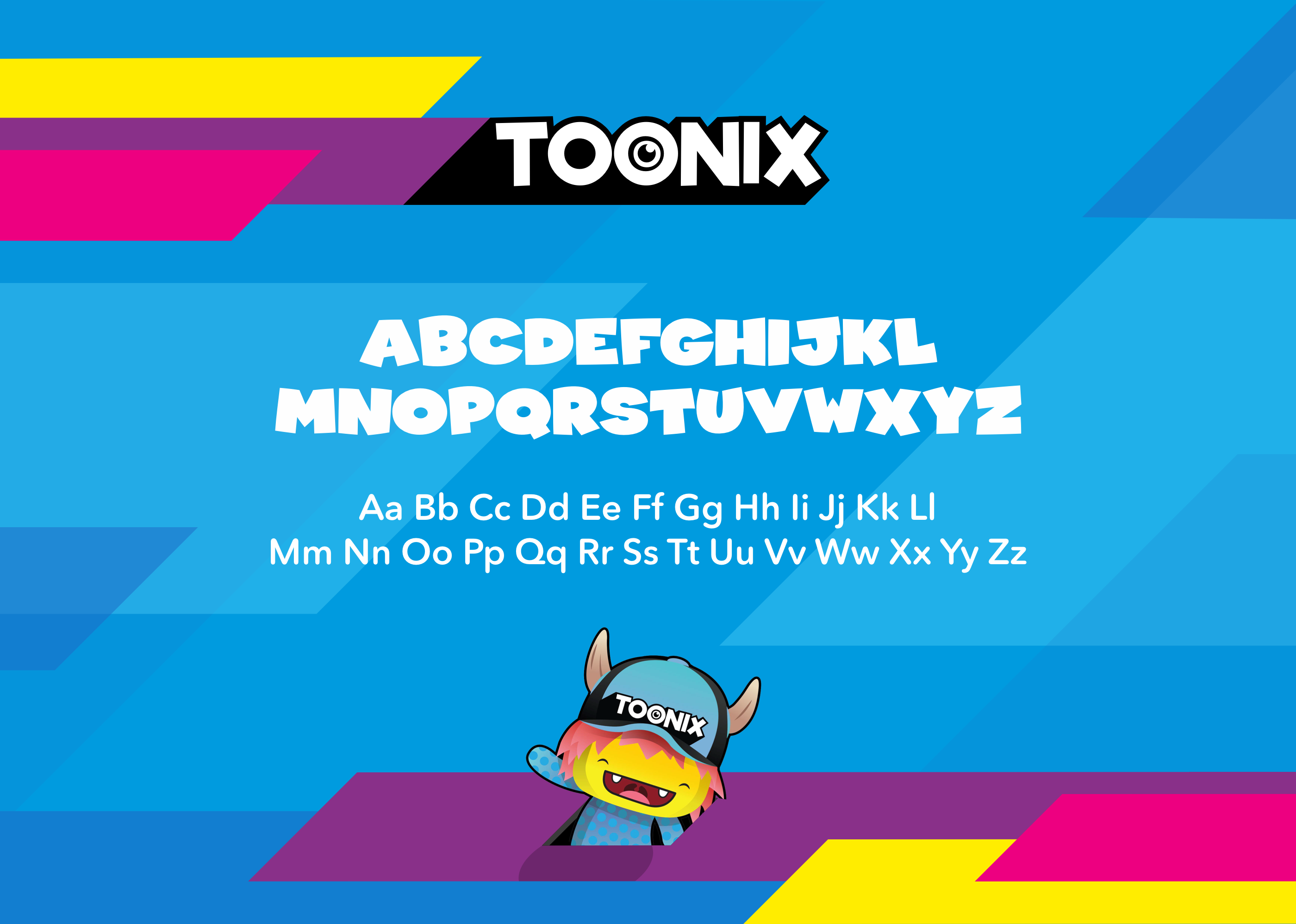
The client had an initial basic brand style guide displaying fonts, primary colour palettes, identity shapes and the logo. The main vision for the Toonix brand, was around personalization with children. They had also created new cartoon characters that were meant to feel as real as possible by interacting with the child.
Preliminary POC
Before kicking off the official project, we had completed a smaller version of the app delivered as a proof of concept (POC) project. The main purpose for the POC was to establish backend integrations and prove the technical feasibility with our engine. We took the opportunity to establish a character animation strategy that could be dynamic and scalable for the future. I worked closely with the motion designers and developers to find a solution for how multiple characters could be built and animated across multiple screens with different animations — all within our scope and timeline. The POC was a success and we won the business for the main project. We took what we learned and expanded the ideas into the official project, including our character animation strategy.
I’d be happy to share more details about the POC project one-on-one.
Goals, Requirements and Challenges
The key business goal was to gain paid subscribers for this new video app service. The goal of the brand was to have each of the Toonix characters feel unique and as real as possible. Our biggest challenge, was the very aggressive timeline — working towards a strict launch date. We decided to put a strong emphasis on designing reusable components and screen templates that would be flexible enough to include our dynamic Toonix characters.
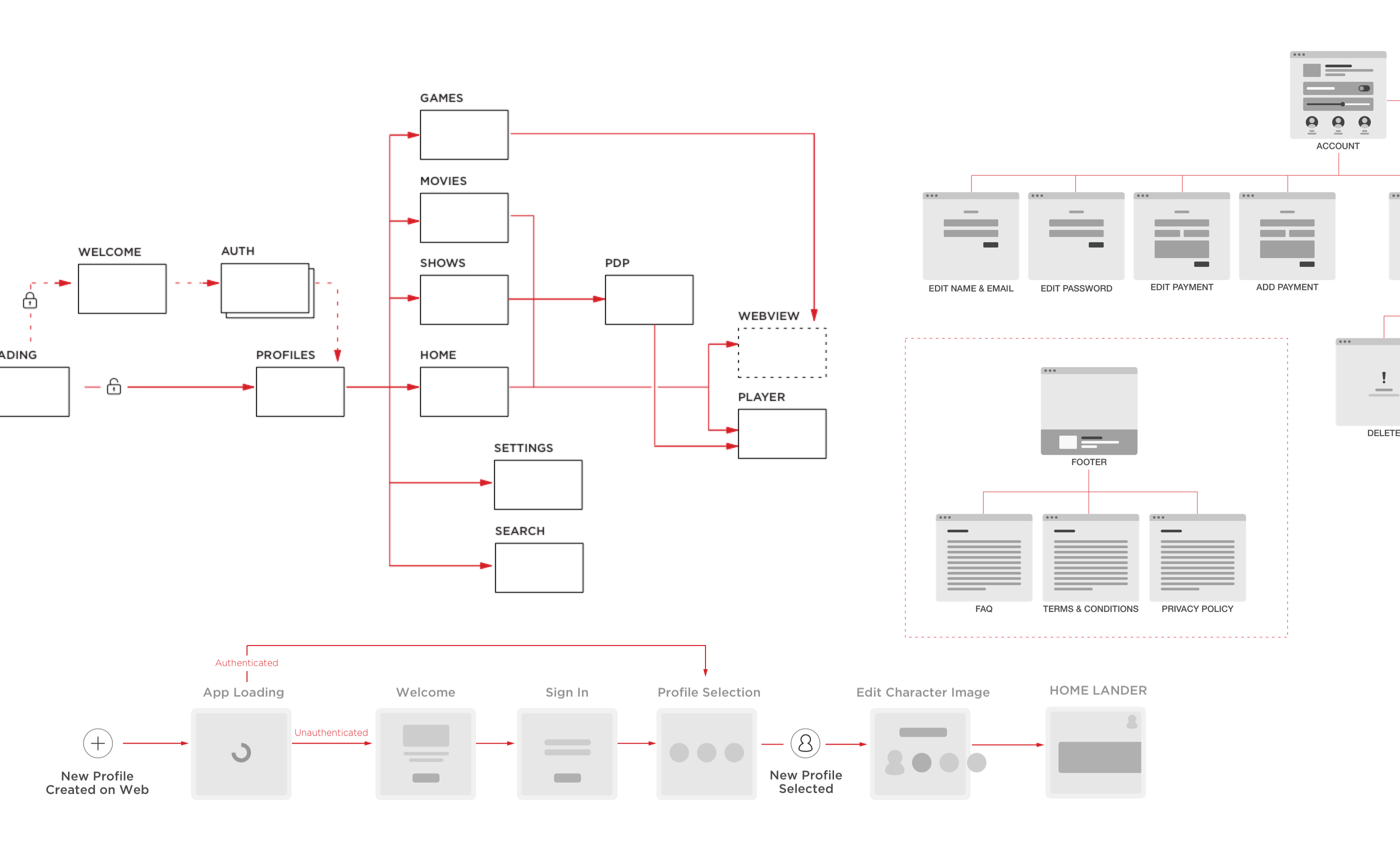
The app would be primarily used by kids ranging from ages 4 to 12 years old, while the website, used for account management and registration, would be used by their parents. We did extended research and multiple rounds of user testing to understand children’s watching behaviours and patterns. We quickly realized, that kids from 4 to 6 years old had very different capabilities than 7 to 12 year olds. We had to design an app that would be easy to use and fun for all age groups. While determining the information architecture, I created sitemaps and extensive user flows for each feature within the app and the web before moving into annotated wireframes.
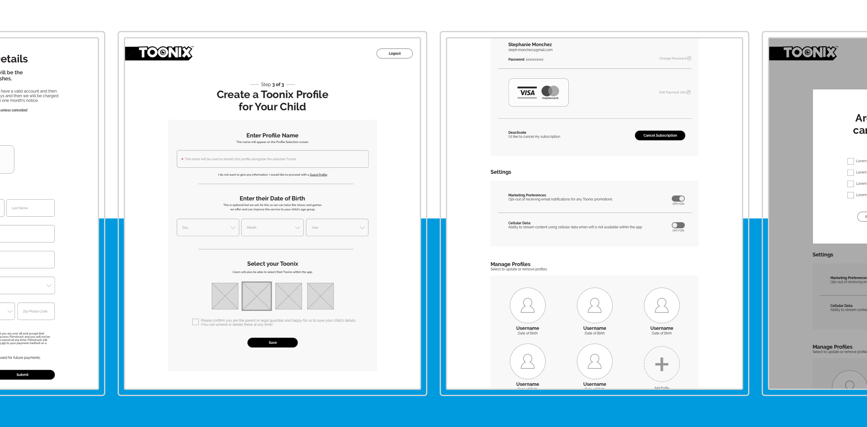
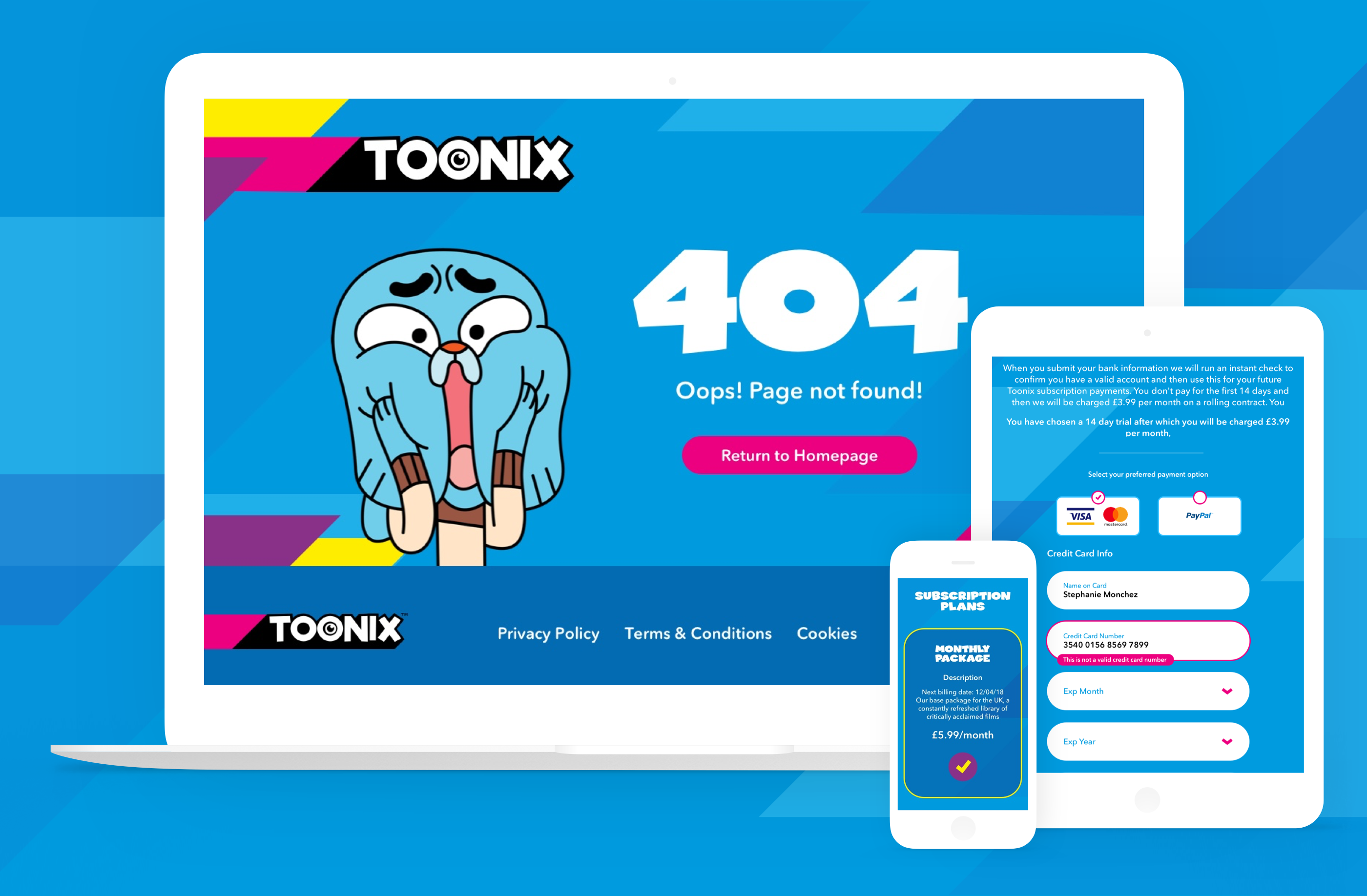
We were designing a whole new website for adults with registration and account management while designing and building a video app for kids at the same time. As lead designer, I was managing different team members on both projects. Both the app and the website needed to have consistent designs but be tailored for each of our target user’s experience.
The Solution
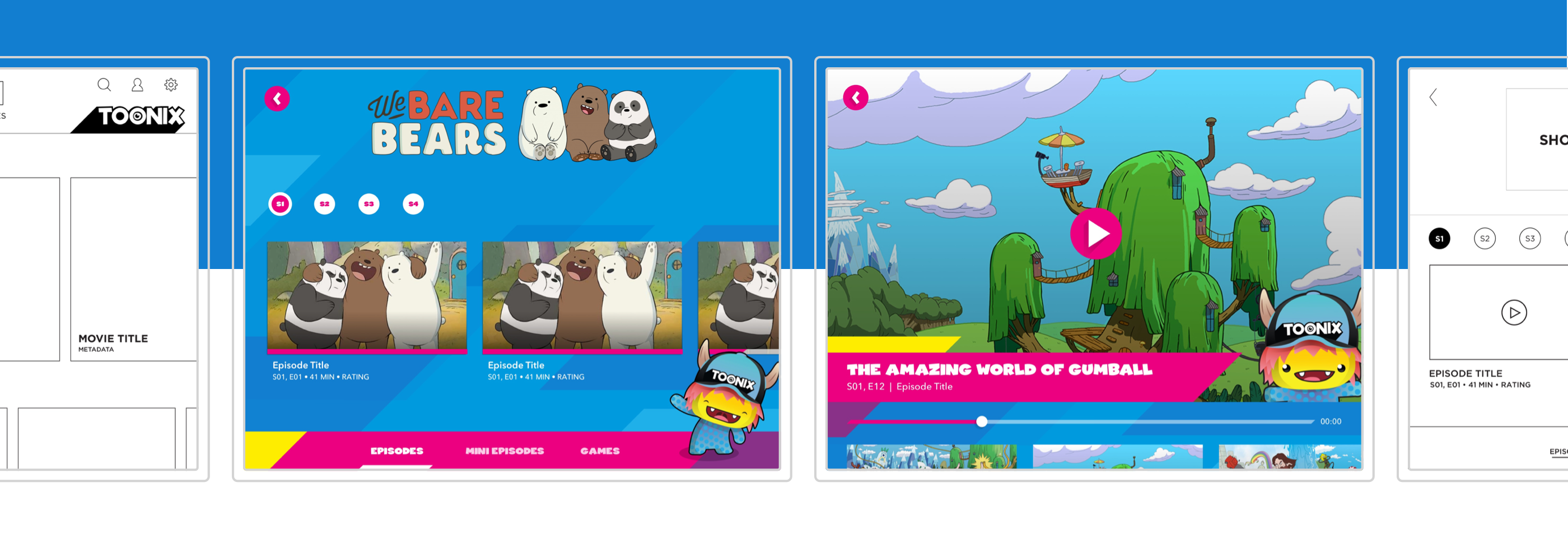
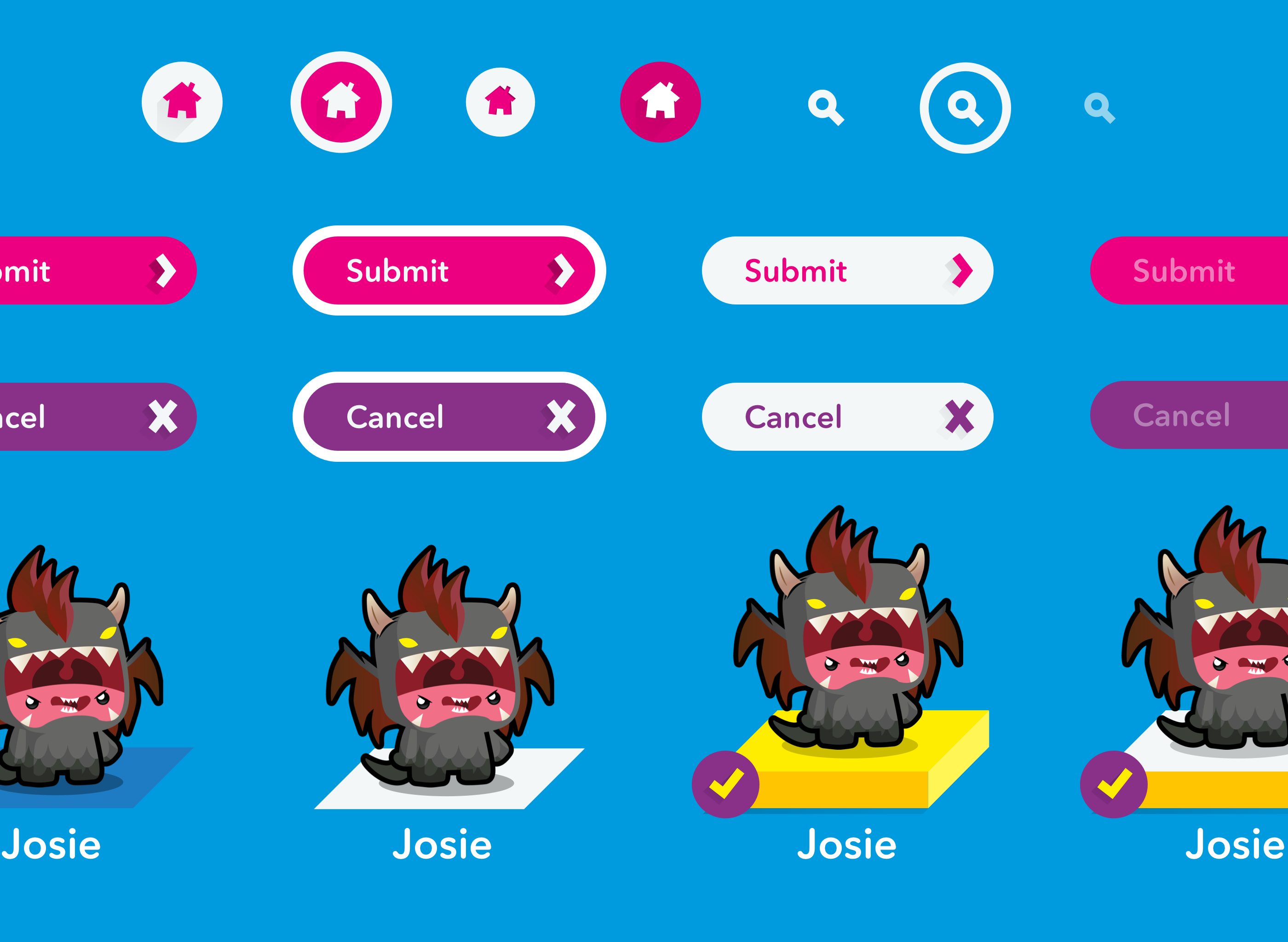
From the initial brand, we set out to build a full set of user interface components and style sheets that would be used for the app and website designs. We used Sketch for wireframes and visual designs. For the app experience, the motion designers use Adobe After Effects combined with our product workflow to animate and build components of the screen. For the website, we used Zeplin to translate our design files into developer friendly annotated screens. Both had clickable prototypes, documentation to support the user flow and interaction functionalities and an establish pattern library.
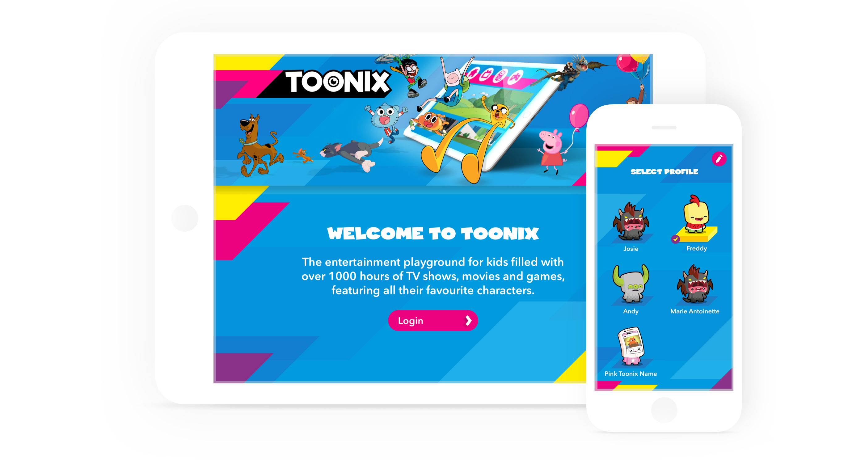
Pick Your Toonix
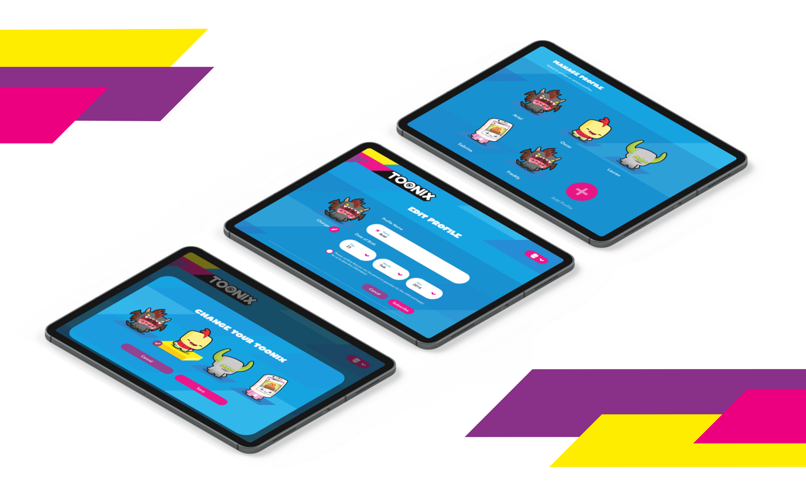
For better personalization, our solution was to let each child favourite a Toonix character that would follow them through the app. Each character expressed their own sense of personality through their appearance and customized animations. Each user would create a profile and get to choose their very own Toonix character. Registration and profile creation was done through the website only as a safe guard for parents to control the age associated with the profile. This would allow for content restrictions based on recommended age ratings. The overall app experience would change based on which user was watching. However, user testing showed great value for kids to be able to pick or change their Toonix character. This feature was brought into the app experience as well.
Flexible Layouts
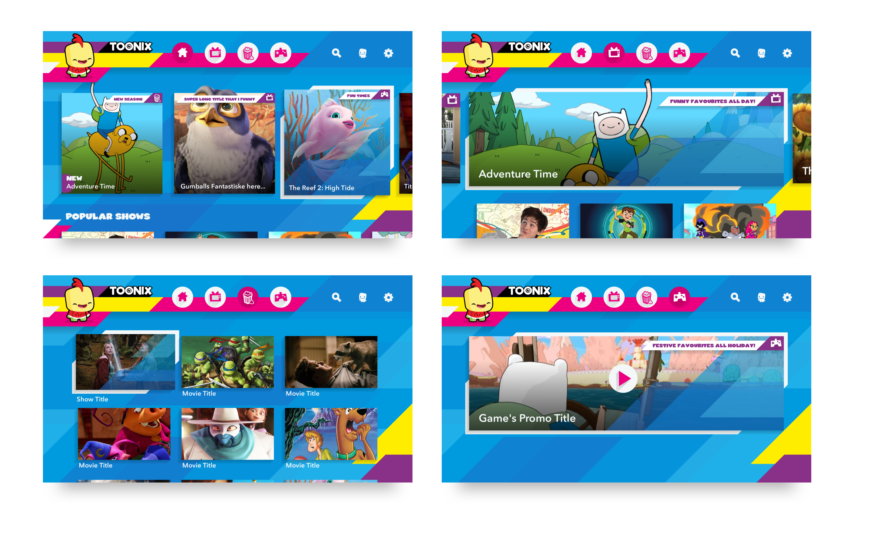
Keeping the brand’s key theme of personalization, we opted to have our users land on a curated home lander first. The content displayed is based off the age of the child — a 4 year old’s favourite cartoon varies quite drastically from an 8 year old. We established 3 other landing pages to filter content by TV Series, Movies or Games.
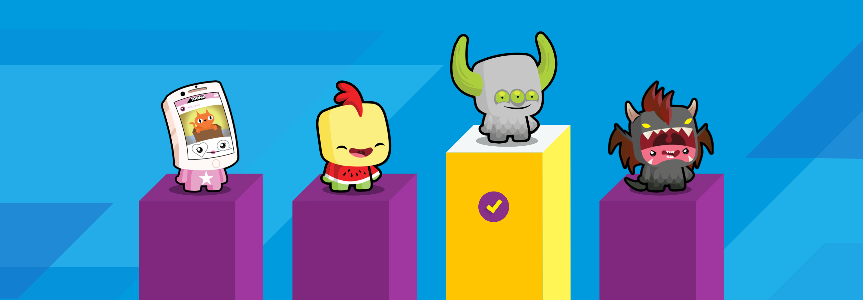
Toonix characters have a prominent placement on the lander screens. Each one has a set of animations tailored to each of their personalities. We first established individual characteristics which would feed into our choice of movements. Each character had a custom in/out animation for the landers. As an extra interaction, we made the characters into buttons so that they would react if users tapped on their Toonix.
Bringing it All Together
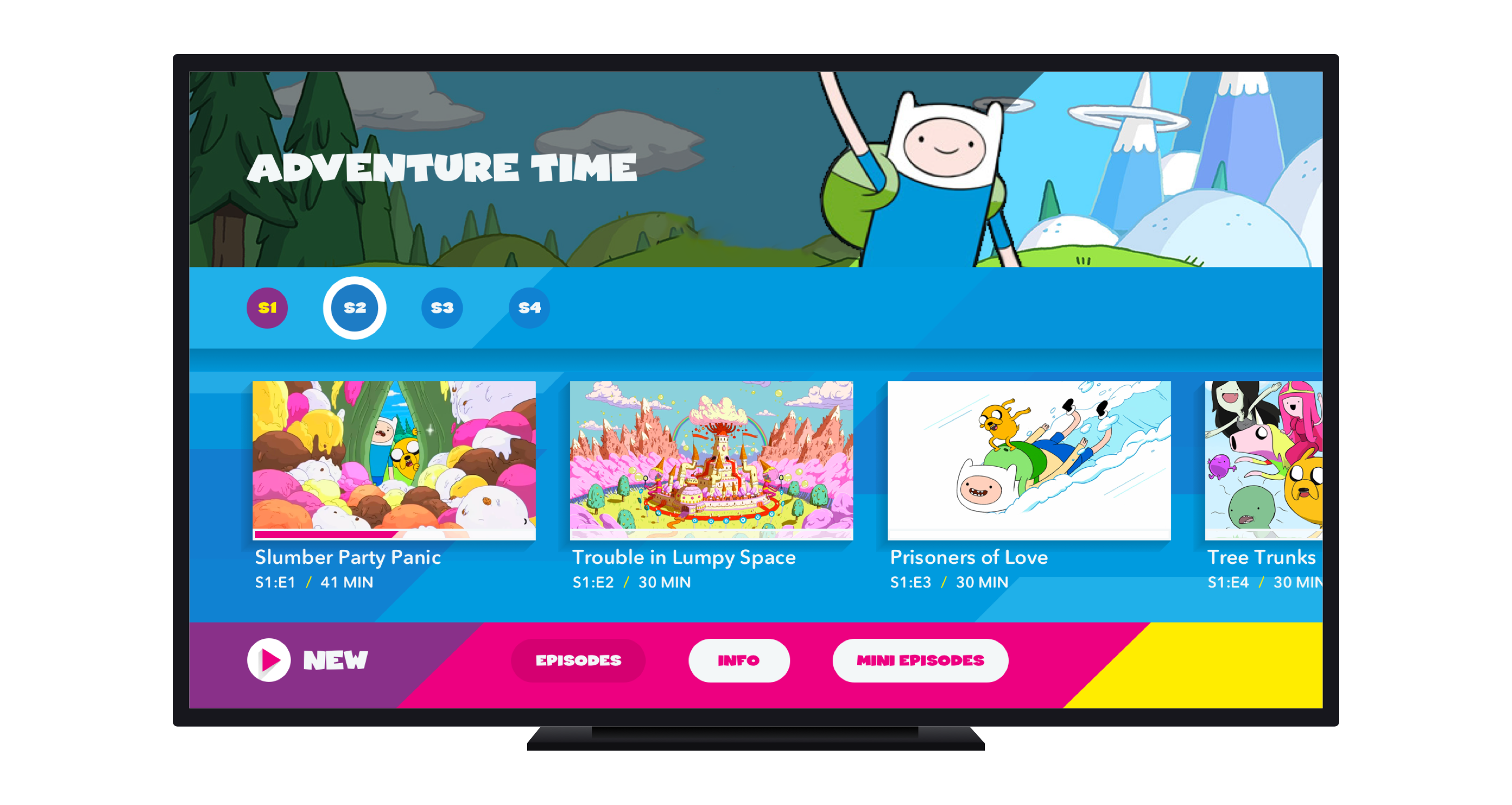
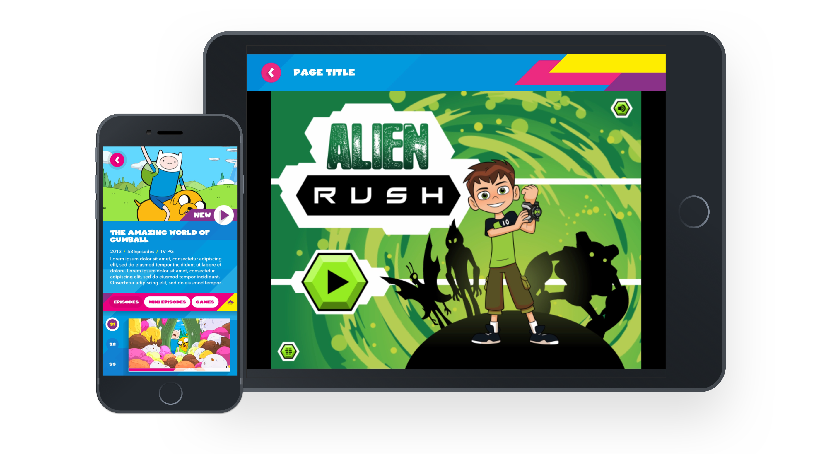
From each of the landers, users can select an asset card to open the franchise’s product details page for a full list of episodes, more info and games. We had dynamic play buttons as part of the menu bar on PDP pages. These would predict what episode the user might want to watch based off bookmarking history — start from beginning, resume or watch newly added episodes.
Through user testing, we noticed younger age groups tended to remain on the home screen scrolling through the swim lanes. The older age groups tended to use the menu icons and would scroll through all the content by type. All kids, immediately wanted to go to games section. We wanted to make games more accessible and easy to find. To tailor both age groups, we had an all games navigation item at the top that would display all games available throughout the app. We also opted to add a games tab within each product details page that would display any games related to that franchise. Games would be available through a web view on tablet and handset devices.
Toonix is available for download in the Nordic region – Sweden, Denmark, Norway and Finland — in both local languages and in English. Please note that the home page of the website is designed and maintained by Toonix’s internal marketing team. All other pages were designed with my art direction. To see the live website or download the app, please visit: toonix.com or the App Store
